The hunt is over. You have been faithfully scouring flea markets and Marketplace for what feels like forever, and now you have found that perfect piece of vintage furniture.
It’s in your garage, waiting for your magical touch to transform it into a thing of beauty.
The big question now is: How do I pick the right paint color?


With the multiple brands of milk paint, Fusion Mineral Paint, and chalk paint now available, the color choices are endless!
This is a crucial step in your furniture makeover process! If you select the right color scheme (i.e the right paint color), you will make the furniture shine. Pick the wrong one though, and your ending project may not turn out as well as you would hope!
Aren’t you glad I’m here to help?
I’ve put together 3 questions to ask yourself when it comes time to select the right paint color for your next furniture project. These are the questions I consider myself, and I think they will help you pick your color scheme with confidence.
1. What is the scale of the piece?
Just like in fashion, bold colors are best in small doses. The smaller your furniture piece is, generally the bolder the color it can handle.
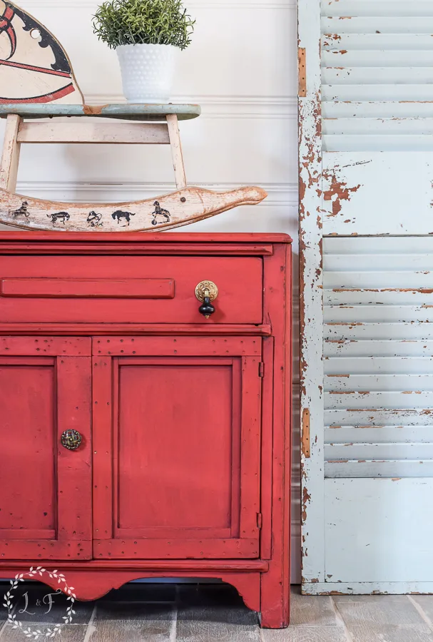
Large scale pieces typically look the best in muted, neutral colors (whites, blacks, grays, etc). There are exceptions to this rule, but if you’re trying to make money painting furniture, then I’d suggest you keep the bright, bold colors off of your larger pieces.
2. What is the style of the piece?
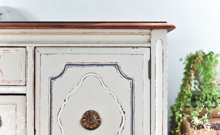
Does the piece have a more masculine style, with straight lines and sharp angles? Or are there feminine touches like carved wood, curves, and molding?
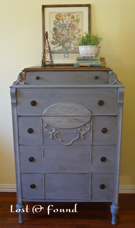

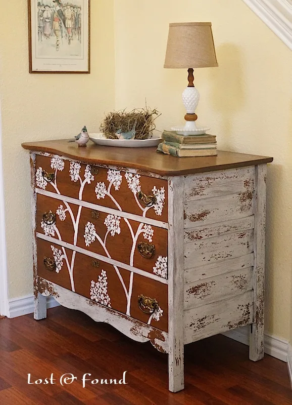
The purple milk paint on this antique chest of drawers works because of its many embellishments. Those “feminine” details support the soft purple color scheme.
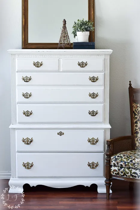
Whereas the simple, straight lines of this mid-century dresser worked best with a neutral white. 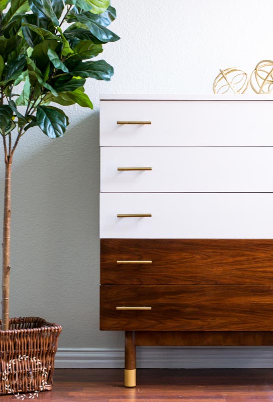

Save your more “fun” colors for the more embellished pieces of furniture.
3. Will you be able to keep any wood tone on the piece?
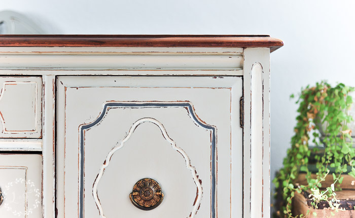
I think this is one of the biggest stylistic questions to consider when picking a color scheme. Are you planning on painting the entire piece, or will you leave some exposed, stained wood?
I generally try at all costs to leave some stained wood on the pieces I makeover. However, sometimes there is no hope for salvaging any of the wood I’m working on, and I have to paint over the entire piece.
Leaving stained wood, whether a stained top or drawers, anchors the color scheme of the furniture. It provides a traditional backdrop for the new painted design, and so balances out the more colorful or non-traditional elements you may add.
I firmly believe that your best shot at successfully incorporating brighter color schemes or bolder designs is on pieces where you can leave some exposed wood.

If I am forced to paint the entirety of a piece of furniture, I typically opt for a muted, neutral color scheme. That helps make sure there’s not too much crazy going on.

Just like any style “rules,” there are many exceptions and perfectly good artistic reasons to sometimes go outside the box!
However, if you are just starting out, I think following these guidelines will help you develop your own personal style, as well as make sure that your furniture makeovers are successful in the marketplace.
As you paint more and get more comfortable with the process, you can experiment with pushing the boundaries some and trying out new color schemes!
Now let’s get painting!
More Furniture Painting Tips!
How to Use Antique Glaze or Dark Wax on your Painted Furniture
7 Bold Color Combos for Your Painted Furniture
How to Stencil a Dresser for a Unique Finish


Linking up to:
Penny Pinching Party Wow Us Wednesday Thrifty Thursday
Alaina
Friday 24th of June 2016
Hello,
Is there any furniture pieces you shouldn't paint or that are better left untouched?
Thanks!
lynn
Wednesday 24th of February 2016
Hi Melanie...great advice. I'm a relative newbie into painting and restoring furniture and really appreciate your pointers. Putting it in my tailwind queue for future reference.
phyllis suthers
Friday 16th of January 2015
I saw a table done in cranberry, peppercorn, and sring green; the paint brand was caromal colors. Where can I find this paint?
Melanie
Sunday 18th of January 2015
I am not familiar with that brand of paint Phyllis. I would be interested to learn more about it. Sorry I can't help!
Ann Marie at Iris Abbey
Tuesday 13th of January 2015
This is a great topic and you've offered excellent advice. I especially love the purple milk paint piece. It's lovely.
Melanie
Tuesday 20th of January 2015
Thanks Ann Marie. That purple chest was such an awesome find, one of my favorite pieces I've worked on. Glad you liked it!
chris aka monkey
Tuesday 13th of January 2015
way good advice easily comprehended thanks xx
Melanie
Tuesday 20th of January 2015
Great, thanks Chris!