Happy June Everyone!
My kids finished up school last week, just in time for 5 days in a row of rain . . .
But we are enjoying the slower pace of the summer days in spite of the constant wetness outside.
I missed sharing a Fusion Color of the Month with you all last month, so I am excited to jump back into things for June.
Today I want to show you Bayberry.
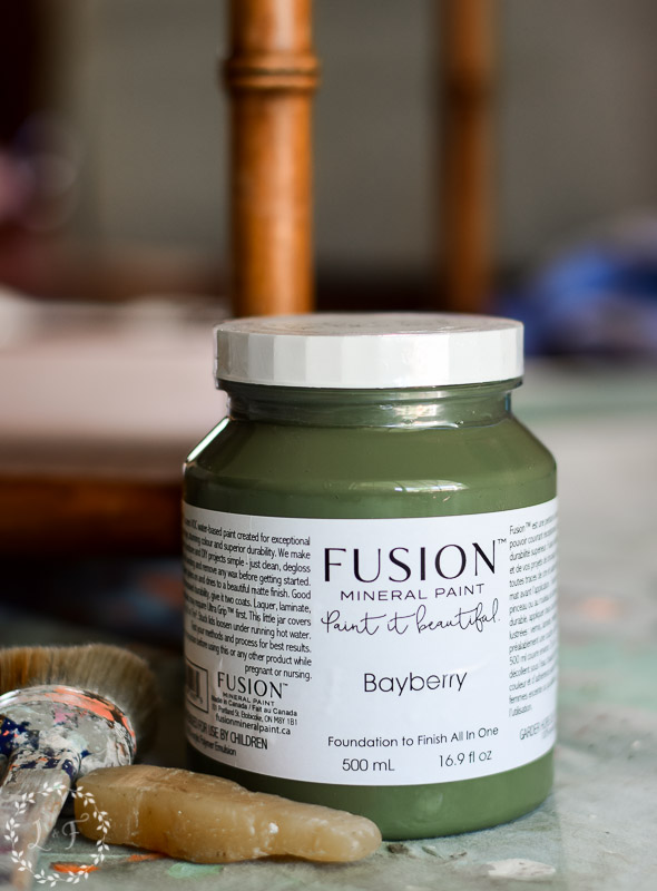

Bayberry is a muted, olive-toned green. It’s the darkest of all of the greens in the Fusion Mineral Paint line, and makes for a great accent color in a space. Bayberry has fantastic coverage and can blend with both warm and cool colors.
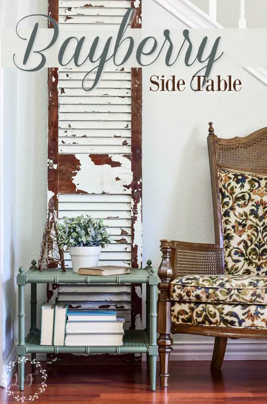
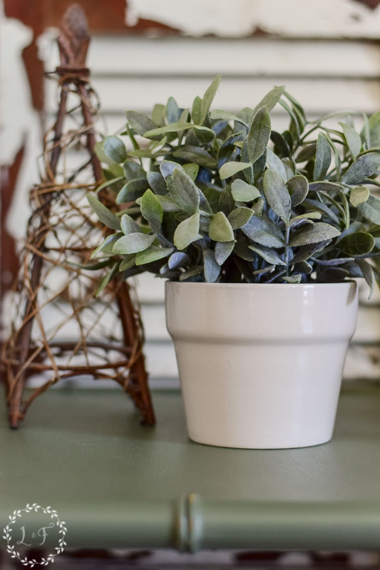
To showcase Bayberry, I have this side table makeover to share.
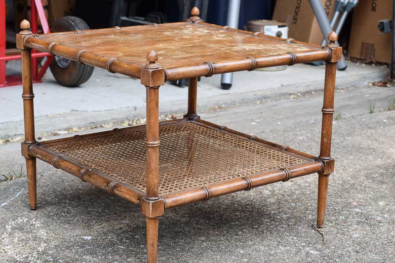

This table was a flea-market find. The faux bamboo and cane shelf totally drew me in–great details!
To prep the table I wiped it down with Simple Green, and then gave the top and legs a light sanding with 220 grit sandpaper. The table top had some flaking on its finish, so I wanted to smooth that out as much as possible before painting.
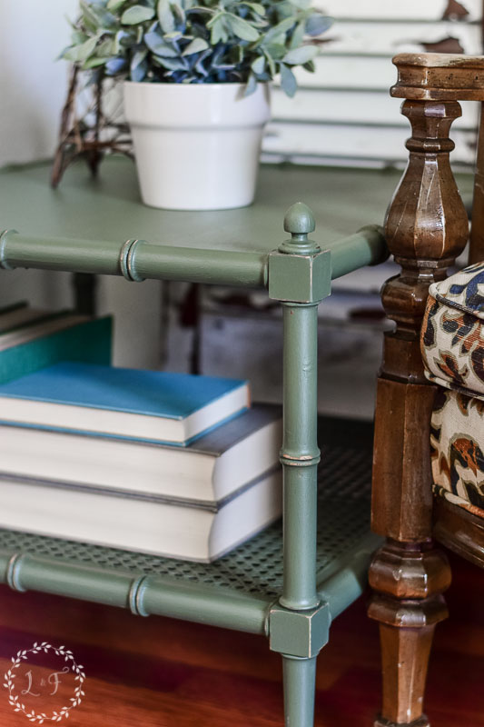
Two coats of Bayberry did the trick, and I finished it off with some light distressing just along the edges and details.

What do you think?

Fusion did a great job covering up the poor, existing finish and I think the green gave the table kind of a funky vibe.
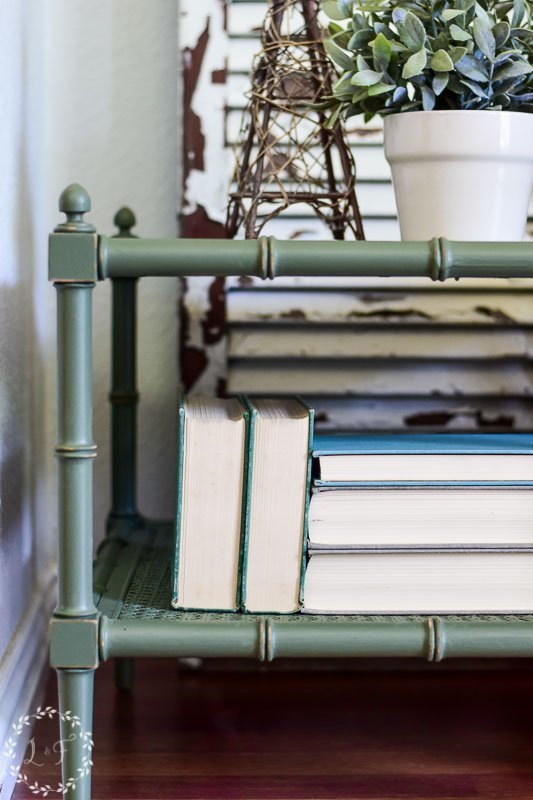

I really like the faux bamboo detail! I’m always excited to find a piece with that pattern.

So can you see using Bayberry in your space somewhere?
I hope you enjoyed this month’s color and makeover! I’ve got another makeover to post soon, this time using MMS Milk Paint. So check back again soon!
And as always, if you want to try out this great color but don’t have a local Fusion Mineral Paint merchant, you can shop for Bayberry and all Fusion products in my online shop.


Have a great week!


Ivory
Wednesday 21st of June 2017
Fabulous fine. I love your side table and chair. Beautiful job!
Melanie
Thursday 22nd of June 2017
Thank you!
Ivory
Wednesday 21st of June 2017
Fabulous fine. I love your side table and chair. Beautiful job!
Melanie
Thursday 22nd of June 2017
Thank you!
Steph
Tuesday 13th of June 2017
So beautiful! This is a favorite piece for me....I'm loving bamboo too, and have been going back and forth on a real bamboo footstool with upholstered cushion. Now I might go for the green!
Melanie
Thursday 22nd of June 2017
Thanks Steph! Glad you found some more inspiration for your own projects :)
Anette Sullivan
Friday 9th of June 2017
You always inspire me! Absolutely lovely!
Melanie
Thursday 22nd of June 2017
Thank you so much Anette!
Mae Yael Di Lodovico
Thursday 8th of June 2017
Loooove it! I'm a blue/green girl, so I painted all window and door frames and skirting boards in olive green. Accented with whites and blues it looks so calming. Highlights in copper, brass, tin and the odd touch of gold. Couldn't think of any thing else to better it. You did a great job with that cute table and can leave it at my place anytime!