Awhile back I sent out a survey to a selected group of my readers asking what they would like to hear from me; what helpful information could I offer?
Several of the replies mentioned wanting more help in choosing bright colors for their furniture projects.
One of the ladies who responded, rightly mentioned that I don’t tend to work a lot with bold colors, and actually referenced something I had written in a past post about how using contrasting colors on a piece of furniture can sometimes make it look like it belongs in a kid’s room–which most likely isn’t the look you are going for!
She wanted to know how to use color in a way that works.
How to combine bold colors in a way that looks appropriate and sophisticated, not like a preschool playroom 🙂
I loved her idea! If you’re reading this today–Thank you!
So today I am stepping a bit out of my comfort zone and sharing 7 Bold Color Combinations you can use to create awesome painted pieces. I’m also sharing my personal tips for how to pull off these power-color makeovers.
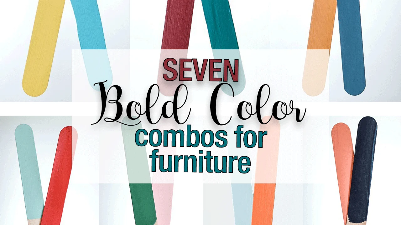
So let’s get started!
These are all Fusion Mineral Paint colors by the way, but you can use similar colors from other paint lines if you choose.
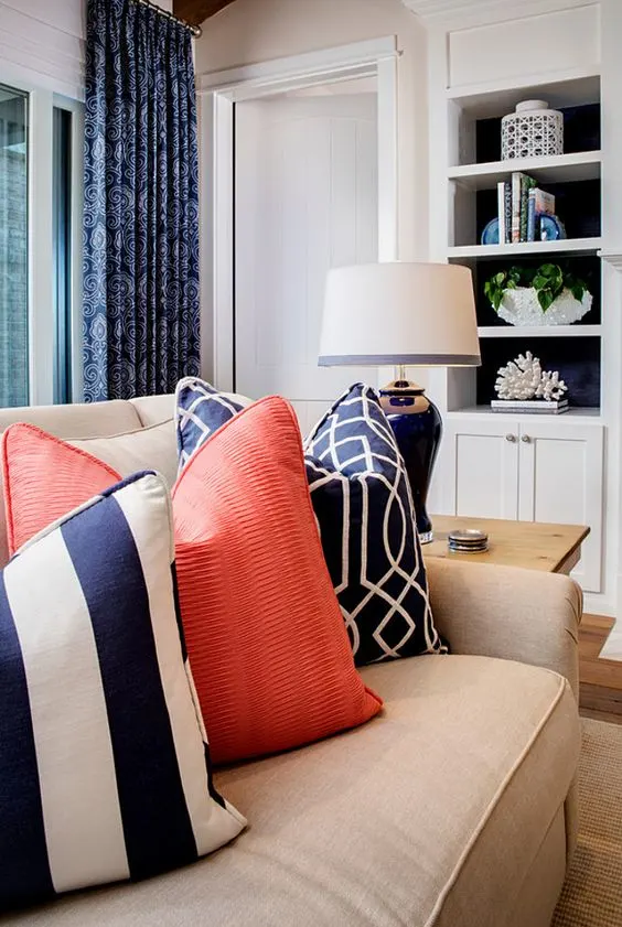
Midnight Blue and Coral
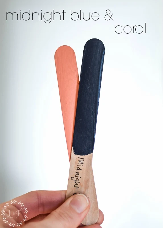
This is a color combination I have actually been wanting to try for a long time! I am just waiting to find the right piece.
I can see in my mind a base color of Midnight Blue with an accented geometric design painted in the Coral–it would be stunning!
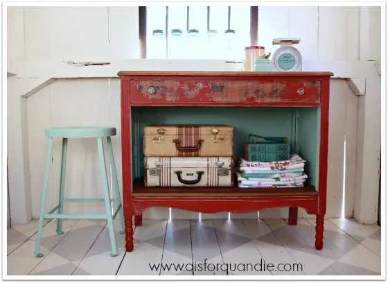
Ft. York Red and Laurentien
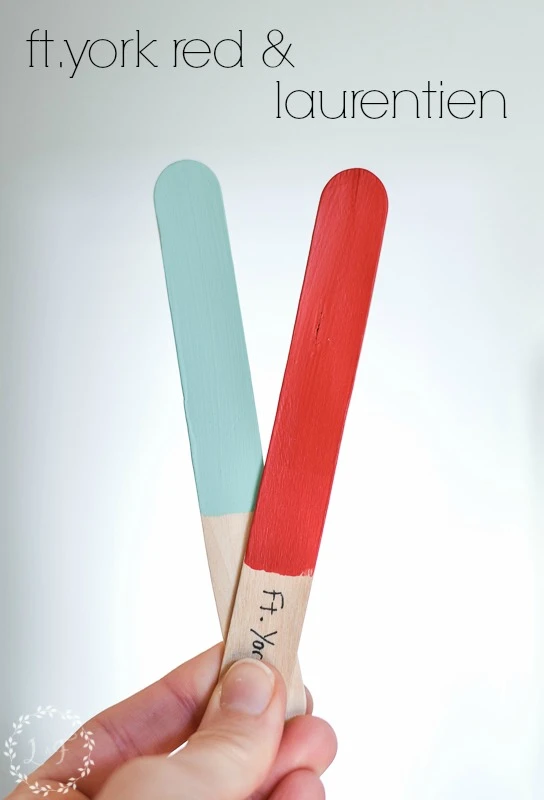
Fort York Red and Laurentien give all the fuzzies:) I’ve loved this color combo ever since I saw it featured on this makeover from my friend Linda. It’s the perfect combination of warm and cold color.
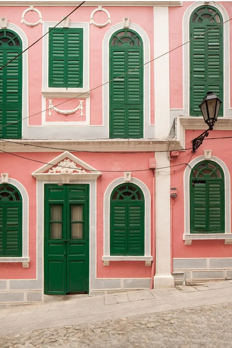
Park Bench and English Rose
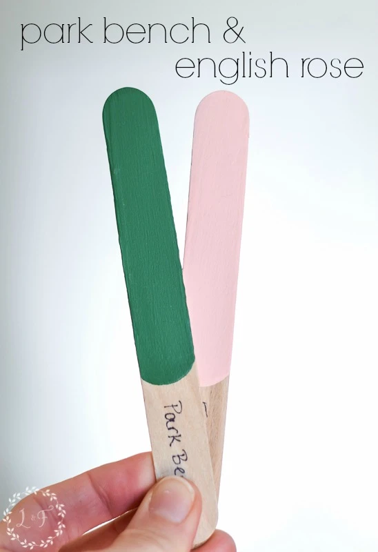
Ya’ll know I am a southern girl at heart, and nothing says “deep south” to me like these 2 colors together. I can see floral dresses and chintz wallpaper in my mind right now!
(Here’s where you can find Park Bench and English Rose is no longer made, here is a similar color called Peony)
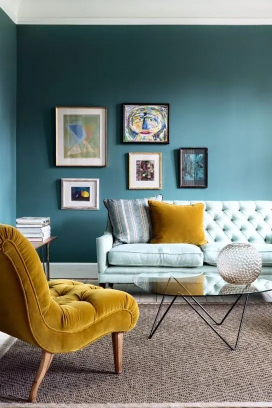
Seaside and Mustard
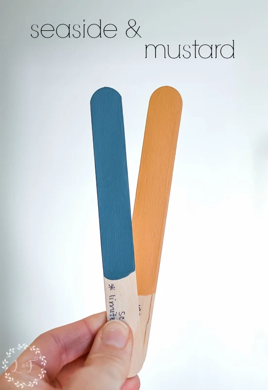
Not quite as bright but still very bold! It’s a very sophisticated color pairing.
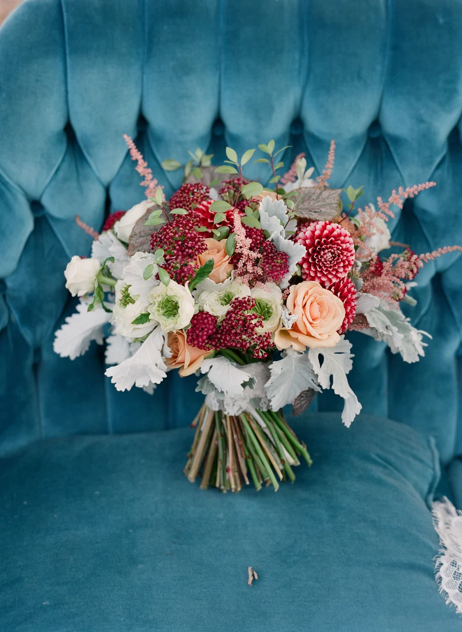
Renfrew Blue and Cranberry
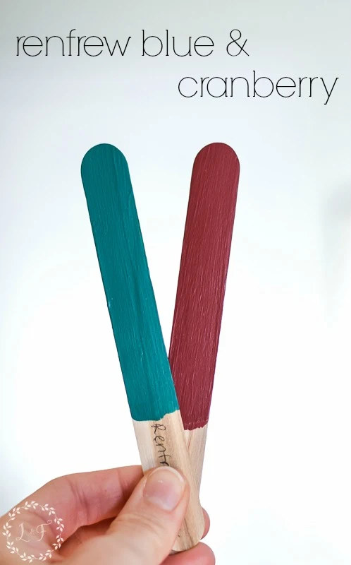
Similar to the above pair, the Renfrew Blue and Cranberry color combo is intense. The two deep, rich colors would give a furniture piece an elegant and stately feel.
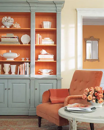
Inglenook and Tuscan Orange
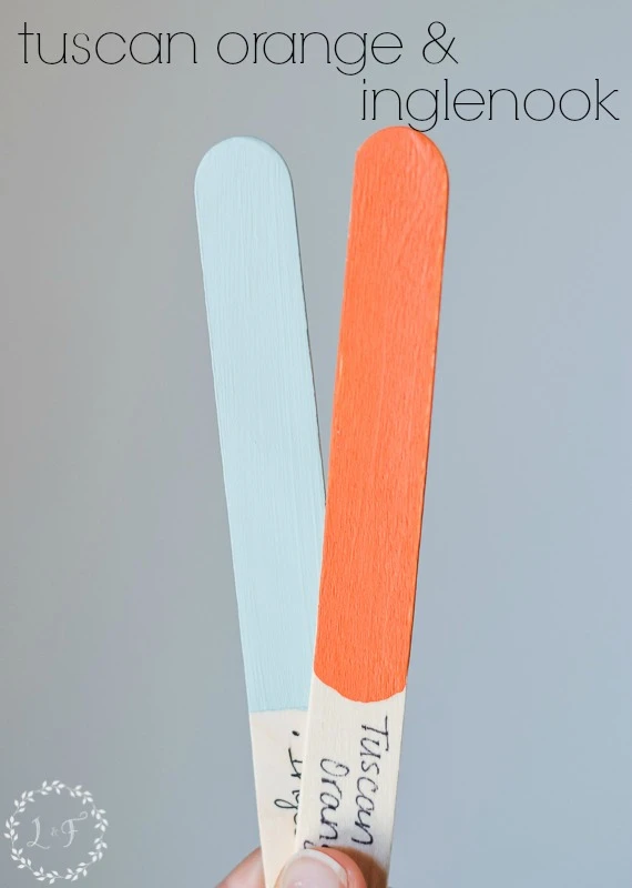
Like the other blue and warm color combos above, this one is a natural pair. Not quite as elegant as Midnight Blue and Coral, or as bright as Ft. York Red and Laurentien, it’s right in the middle ground. Classy but still a little fun.
(Find Tuscan Orange and Inglenook)
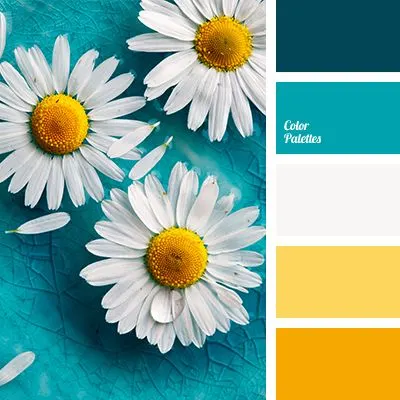
Azure and Little Star
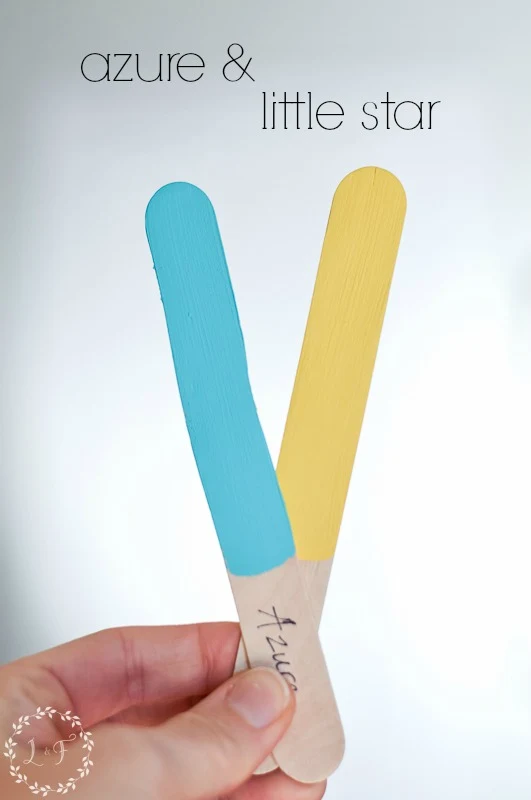
Back to the bright! Of all of the combos shared, this pair will provide the most fun and whimsical color scheme.
You can take it beachy or layer the 2 colors for a distressed, primitive look. (Find Azure and Little Star)
Tips for Combining Color on Furniture
Sometimes less is more!
You don’t have to paint the entire piece of furniture in both colors. Sometimes using the 2 colors as accents on a piece is enough to get the point across.
Or try keeping some of the natural wood to ground the 2 colors and help them not feel so overwhelming.
Add a little white, black, or gray to soften the contrast between the bolder colors
Tossing in some neutral colors helps the eyes not be too overwhelmed by the bold colors. It balances out what sometimes can feel too busy.
Make sure the bold color scheme fits the style, scale, and lines of the piece
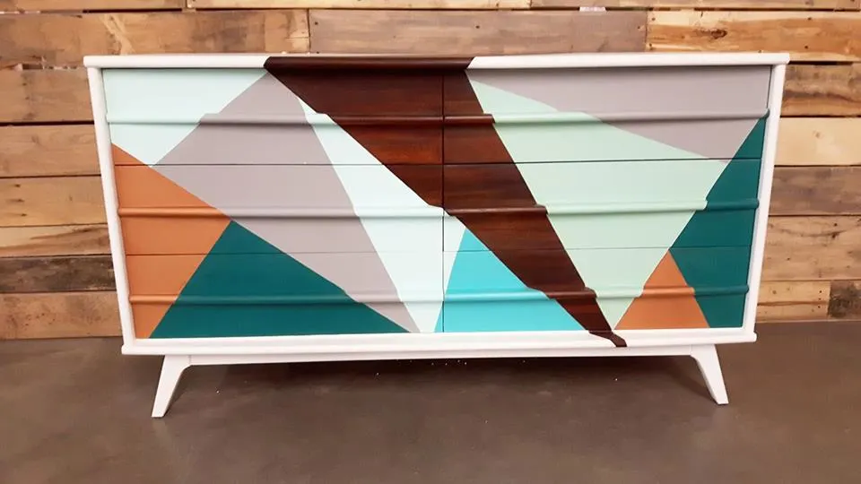
Are you noticing a pattern to the pictures I’ve shared?
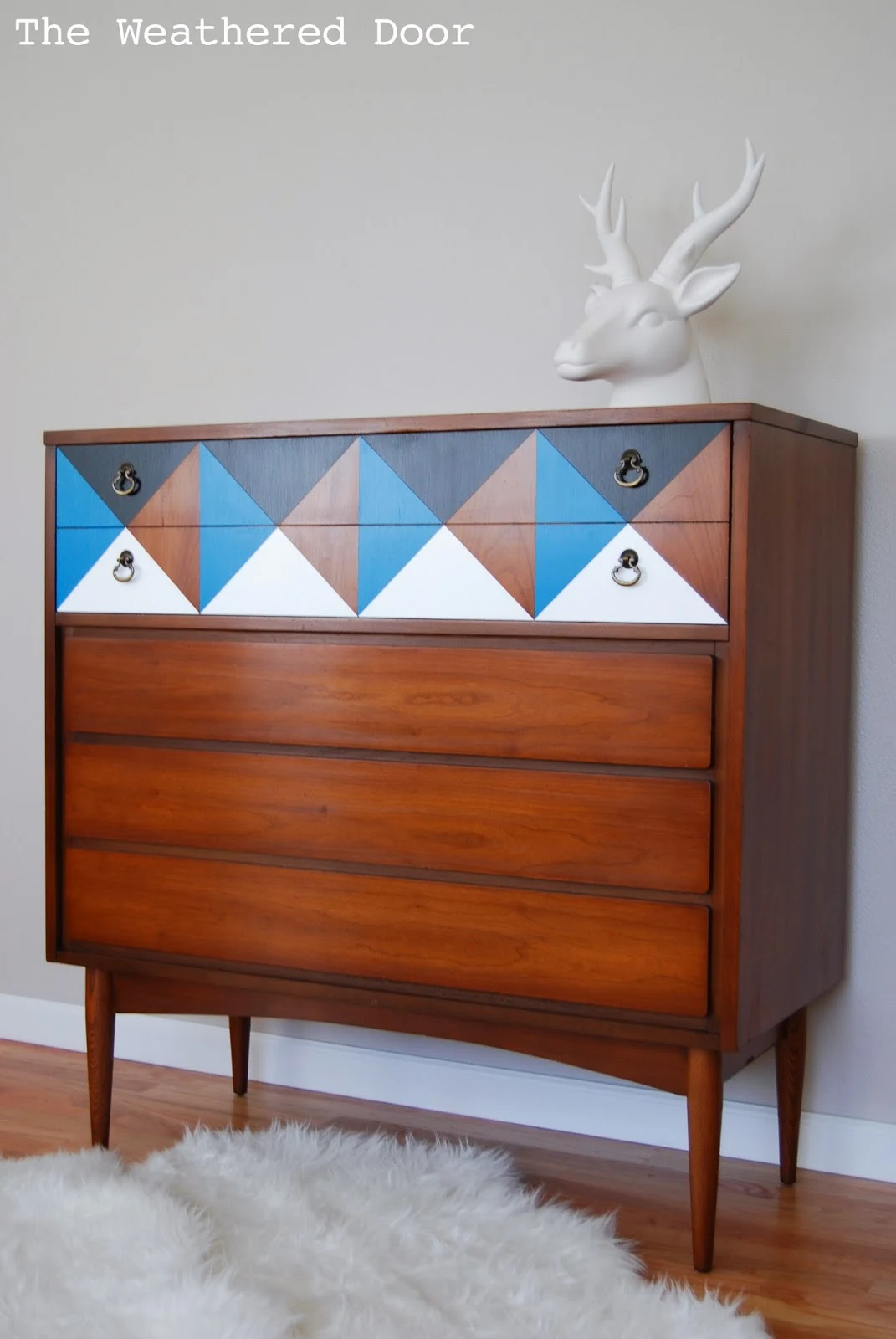
Yes, they are modern styled pieces.
Those clean lines and smooth geometric shapes happen to fit well with bold colors. But you can also use bold color combinations on other style pieces, just be sure it makes sense with the natural style and era of the piece.
Here’s what I mean . . . it’s hard to take a chunky cottage-style piece and make it look like something from the 70’s glam era, right? It just won’t make sense.
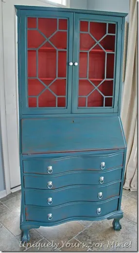
So for non-modern style pieces, I suggest using your bold colors judiciously.
Pick one color to be the main color and use the other for an accent in small areas, or for the interior, like in the photo below.
You can also try distressing the piece to help ease the sharp transition between the 2 colors.
So there you have it! I would love to hear what color combos you try and which ones speak to you the most.
And as always, if you don’t have a local Fusion Mineral Paint retailer and want to try some of these colors out yourself, you can shop online with me here at Lost & Found.
Thanks so much!


Ted Kmiecik
Tuesday 23rd of January 2018
"Blondes"...change to blogs.
Ted Kmiecik
Tuesday 23rd of January 2018
"Blondes"...change to blogs.
Ted Kmiecik
Tuesday 23rd of January 2018
Love your blog and I am really wowed by the graphics that you use for your blog headlines... very nice! To make it easier for some of your lazier readers ( like me ); could you move the " you also might like to read" up to the top of the page? For some odd reason I like to read three or four of your wonderful blondes in a row. And each time I finish one I am returned to the top of the page where I started. But oops! Can't find the next blog.
Susan
Thursday 18th of January 2018
I love these. Wonderful examples of how to tastefully add bold beautiful color without making a piece garish. Using the right complimentary color is key. When a large piece is completely painted in a bright, bold color, it takes attention from everything else in the room. It makes a very large statement. It becomes an attention hog. Using the right complimentary color, lessens the boldness making it share with the accent(complimentary) color. I'm not sure which combination I would choose, because I really liked every one. You have a good eye Melanie, excellent color choices! Great info!